
Partners Healthcare
A UX audit and presentation to the Partners Healthcare
Role:
UX Designer
Agency:
OHO Interactive
Software used:
Sketch, Google Slides
Live link:
Partners HealthcareOverview
Throughout the audit, there were some overarching questions we asked ourselves about the site:
- Are the first steps a new user takes clear?
- Is the user experience consistent throughout the site?
- Is it easy to navigate, or easy to get back to where you left off as a returning user?
- Are there any general accessibility issues in the site (e.g., is there enough contrast between the text and the background)?
Guiding Questions
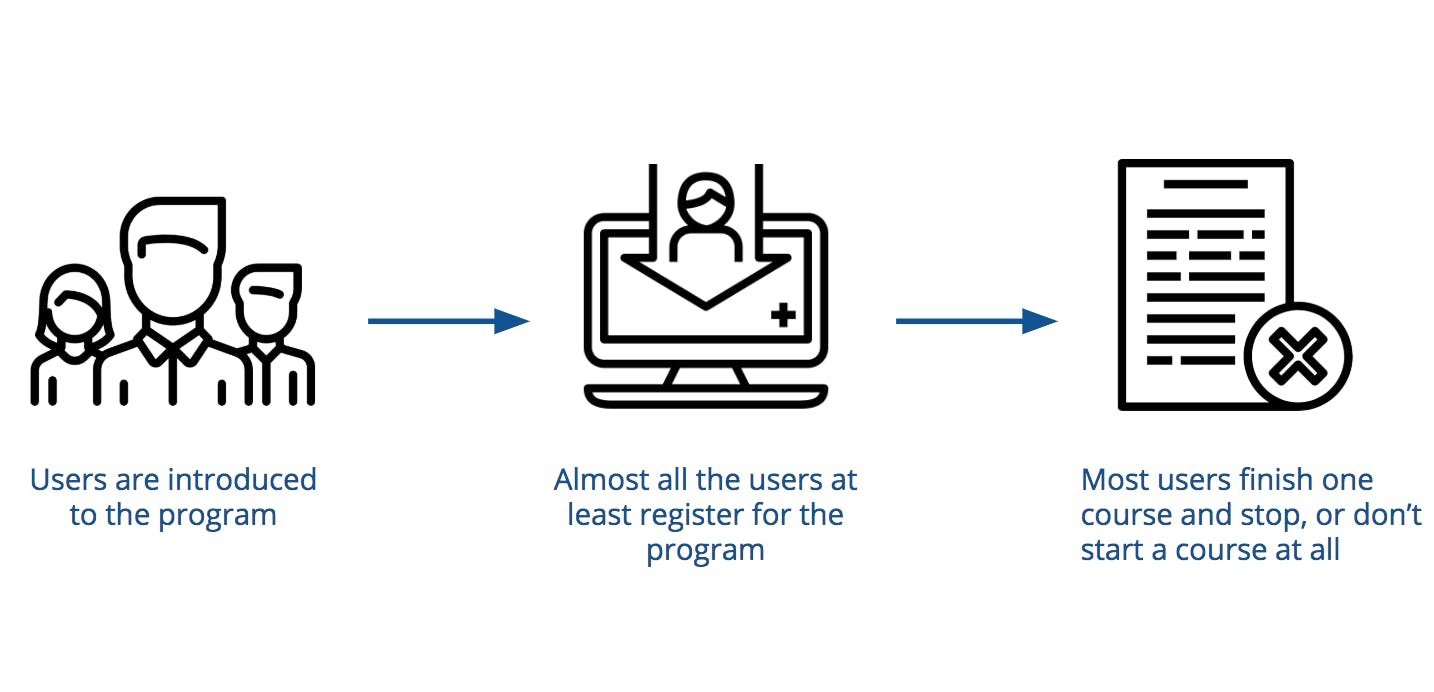
In researching the project, we wanted to find out why users were dropping off after starting. We found that users are introduced to the program at a pretty large scale and complete the registration. However, most of the time, the users don't finish a single course or start one at all.
The issue
Possible Reasons
How could we tell the user what the next step is?
Our team decided on curating information for both new and returning users that would give the next step in the program.
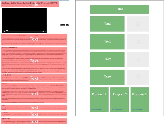
The Homepage
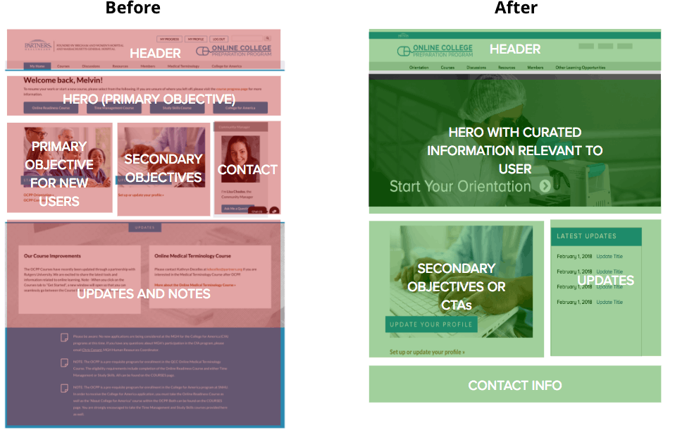
Orientation page
Outcomes
In the end, it was a great learning opportunity for me and Partners Healthcare. Prior to working at OHO, I chose colors without considering contrast for users that experience colors differently. Learning about web accessibility helped me make more inclusive design decisions and guide clients through UX best practices.
Reflection
In the end, it was a great learning opportunity for me and Partners Healthcare. Prior to working at OHO, I chose colors without considering contrast for users that experience colors differently. Learning about web accessibility helped me make more inclusive design decisions and guide clients through UX best practices.