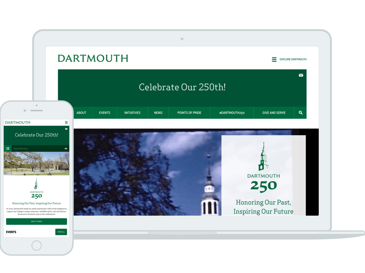
Dartmouth College
Designing a site to celebrate their 250 years of Dartmouth
Role:
UX Designer
Agency:
OHO Interactive
Software used:
Sketch, Invision
Live link:
Dartmouth CollegeAbstract
Before starting any work on the timeline page, we had to come up with a few questions to guide the final product:
- How could we feature Dartmouth's future endeavors and goals in addition to their 250 year history?
- How might we make the page interactive and not just a list of images and text?
- How could we feature all aspects of Dartmouth without favoring one over the other?
- How can we use the site to lead users to the capital campaign site?
Guiding Questions
A Timeline Without Time or Lines
When starting this project, the client suggested a timeline to represent their 250 year history and their plans for the future. However, in this timeline they didn't necessarily want to show the timeline in a strict linear fashion like other colleges tended to do. They also did not want the timeline to be in chronological order.

A Timeline Without Time or Lines
The page not being linear or chronological posed as an interesting challenge. We went through multiple iterations and sketches of ideas for this timeline feature. Prior to the final result, I've toyed around with creating an interconnected web, a circular timeline, gallery pages from various eras, and parallel timelines with the past and future on opposite sides.
Iterations
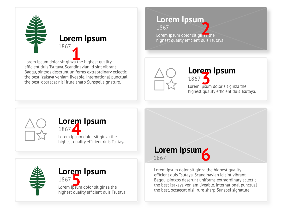
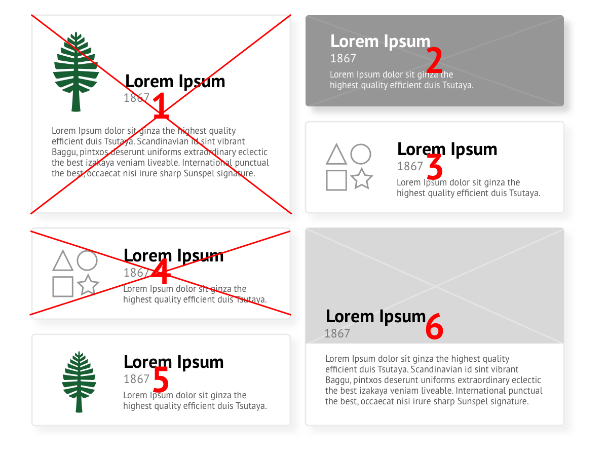
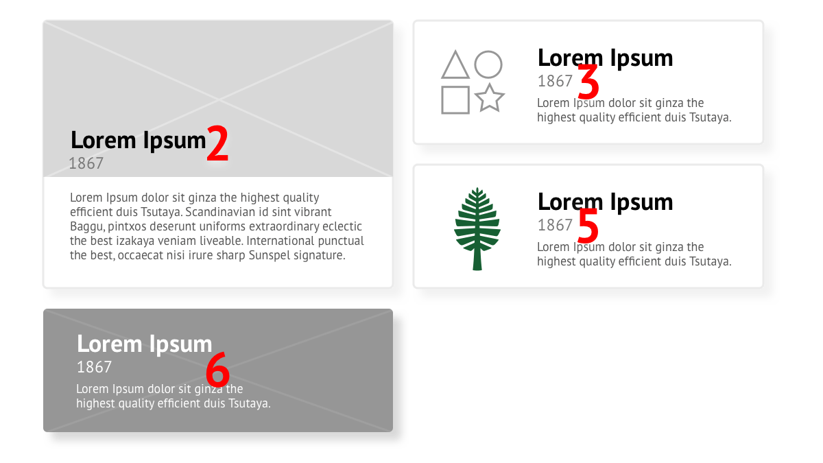
We ended up proposing a modular solution that could be randomized or shifted around if certain results were filtered out by a user.
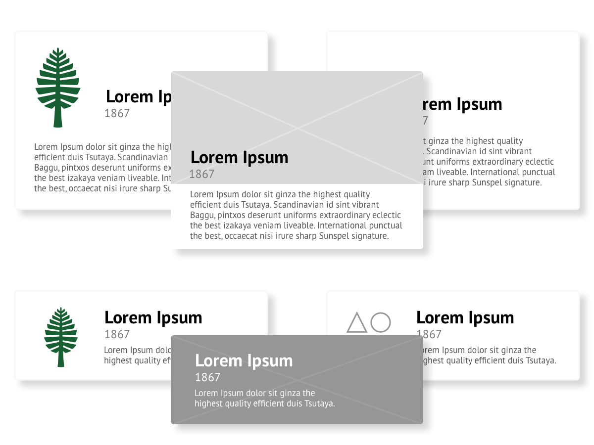
Each section of three could be broken up into three components (one large and two small beside it).
Each of these three components could either be one of: an uploaded image, a chosen icon, or a default icon, accompanied with a title, year, and short description.
The Timeline Solution
We ended up proposing a modular solution that could be randomized or shifted around if certain results were filtered out by a user.
Each section of three could be broken up into three components (one large and two small beside it).
Each of these three components could either be one of: an uploaded image, a chosen icon, or a default icon, accompanied with a title, year, and short description.
How much content?
The Tagging System
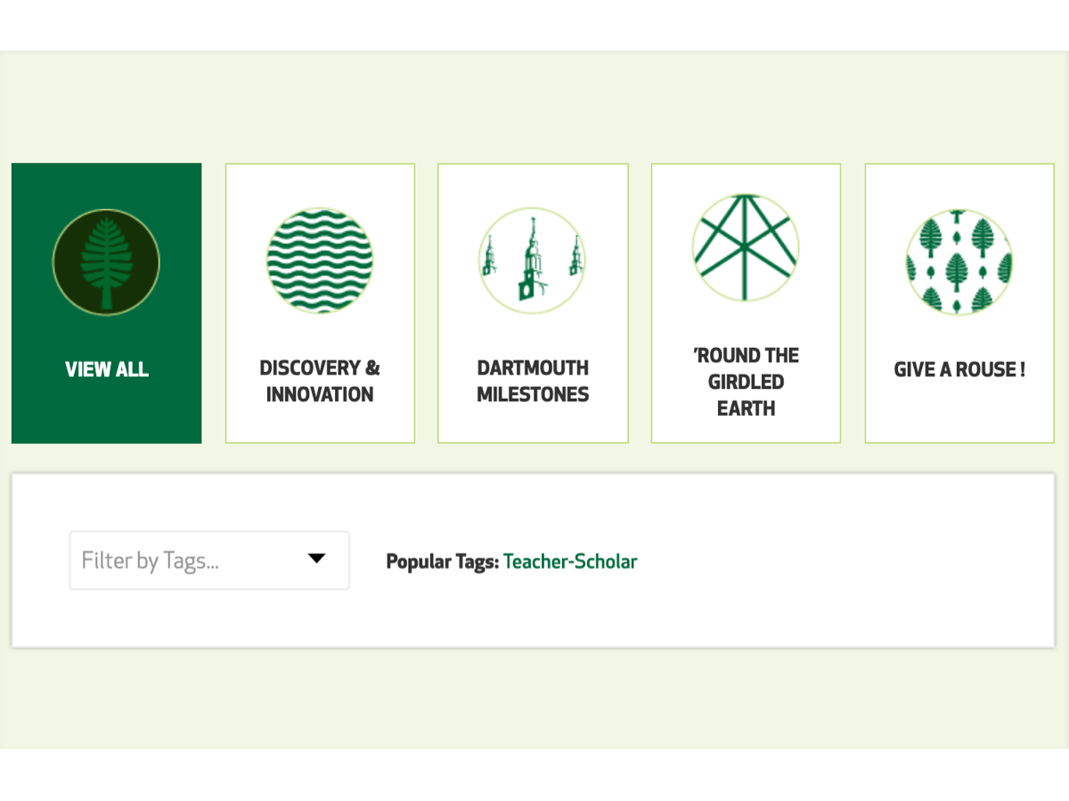
The client always wanted to have four or five cornerstones for the timeline but wanted a way to prevent departments from feeling unequally represented.
We suggested breaking down the filtering into two levels: the overarching cornerstones to represent all of Dartmouth, and a more granular tagging system to help filter down results further.
In addition, We suggested randomizing the content, whether on page load or once after entering in content, to ensure that all departments have an equal opportunity to be represented on the top or first few pages of the timeline.
The Tagging System
The client always wanted to have four or five cornerstones for the timeline but wanted a way to prevent departments from feeling unequally represented.
We suggested breaking down the filtering into two levels: the overarching cornerstones to represent all of Dartmouth, and a more granular tagging system to help filter down results further.
In addition, We suggested randomizing the content, whether on page load or once after entering in content, to ensure that all departments have an equal opportunity to be represented on the top or first few pages of the timeline.
Reflection
The Dartmouth 250th project was one of the last few projects I worked on at OHO Interactive, and it was the first project where I was the primary UX designer. It was an extremely constructive experience for me as the primary UX designer since I would lead calls with the client and stakeholders to discuss the project constraints and final deliverables.
Seeing the project through from its discovery and research to sitemapping to wireframing helped me learn a lot about a project's lifecycle and balancing timelines to keep on schedule.
The project also let me practice communicating with other developers as I had to explain the timeline concept to backend developers. The computer science half of the degree came into play and helped me easily draw out exactly what needed to be done on the backend to communicate with the frontend and how it relates to the design.