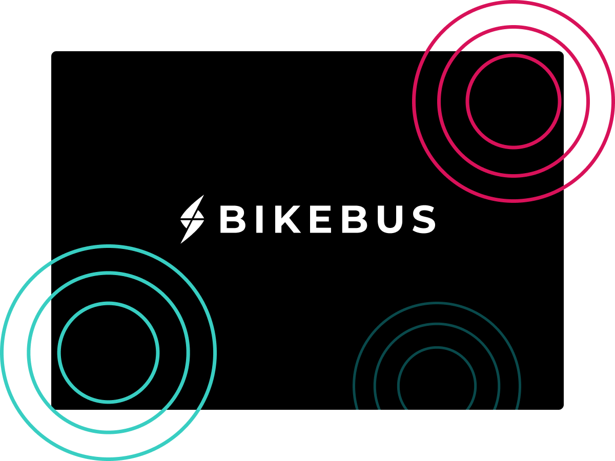
Scout: Bikebus
Indoor Cycling. Now on the open road.
Role:
Project Lead, Frontend Developer, Designer
Agency:
Scout at Northeastern University
Software used:
ReactJS (Styled Components), GatsbyJS, Sketch
Live link:
Scout: BikebusWho is Bikebus?
How could Scout help Bikebus?
Planning a Project
Bikebus was meant to be a high-energy and luxurious experience, yet its initial site and branding reflected an opposite feeling of that. Its logo featured rounded letters shaped similarly to a bus—not usually thought of as the most luxurious form of transportation. Luckily for us, the client was more than willing to let go of their brand and create a new one, and so we did.
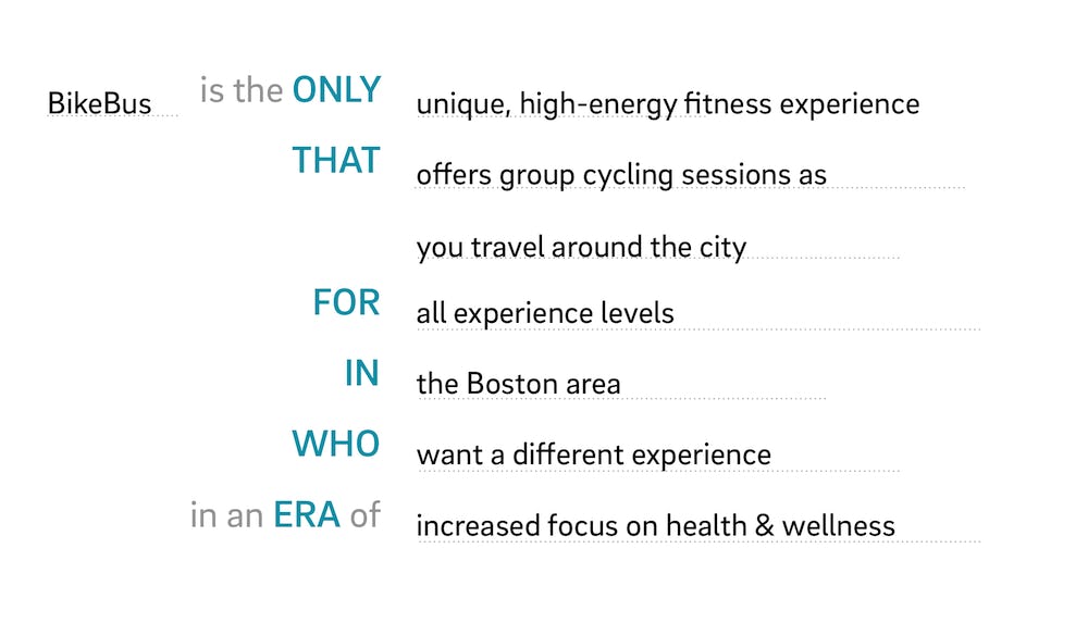
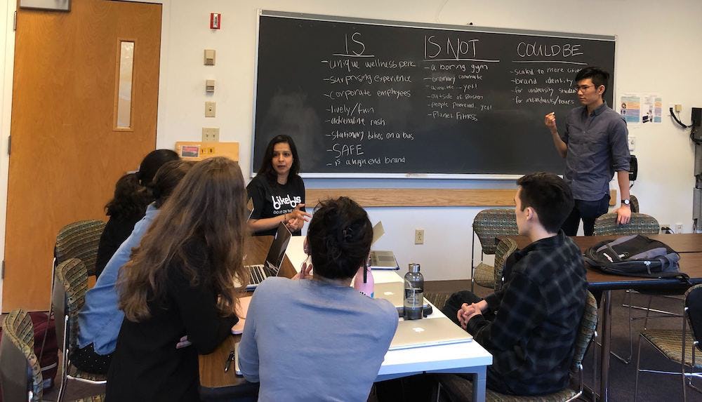
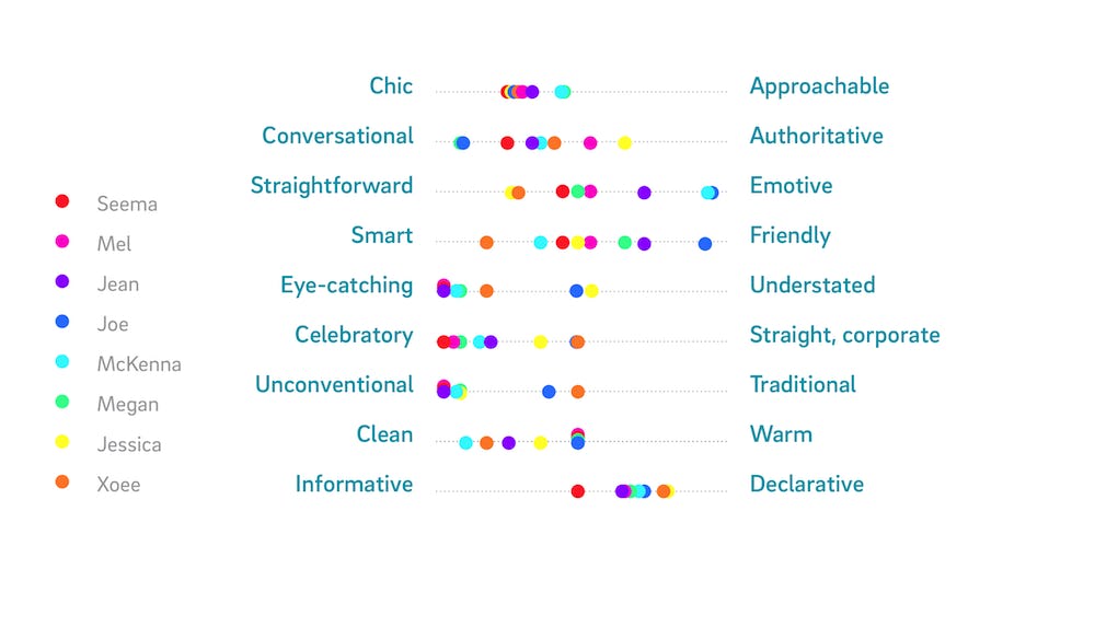
We started with a few branding exercises to get to know what the client really wanted in their company. In the very first meetings, we came up with answers to how we want to move forward with the Bikebus brand. Questions like: Was the company going to be unconventional or traditional? Conversational or authoritative? These kinds of questions would shape how we would color palettes and search for fonts. We also put together moodboards for inspiration.
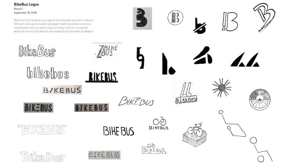
Let’s Build a Brand
Moving Forward with the Brand
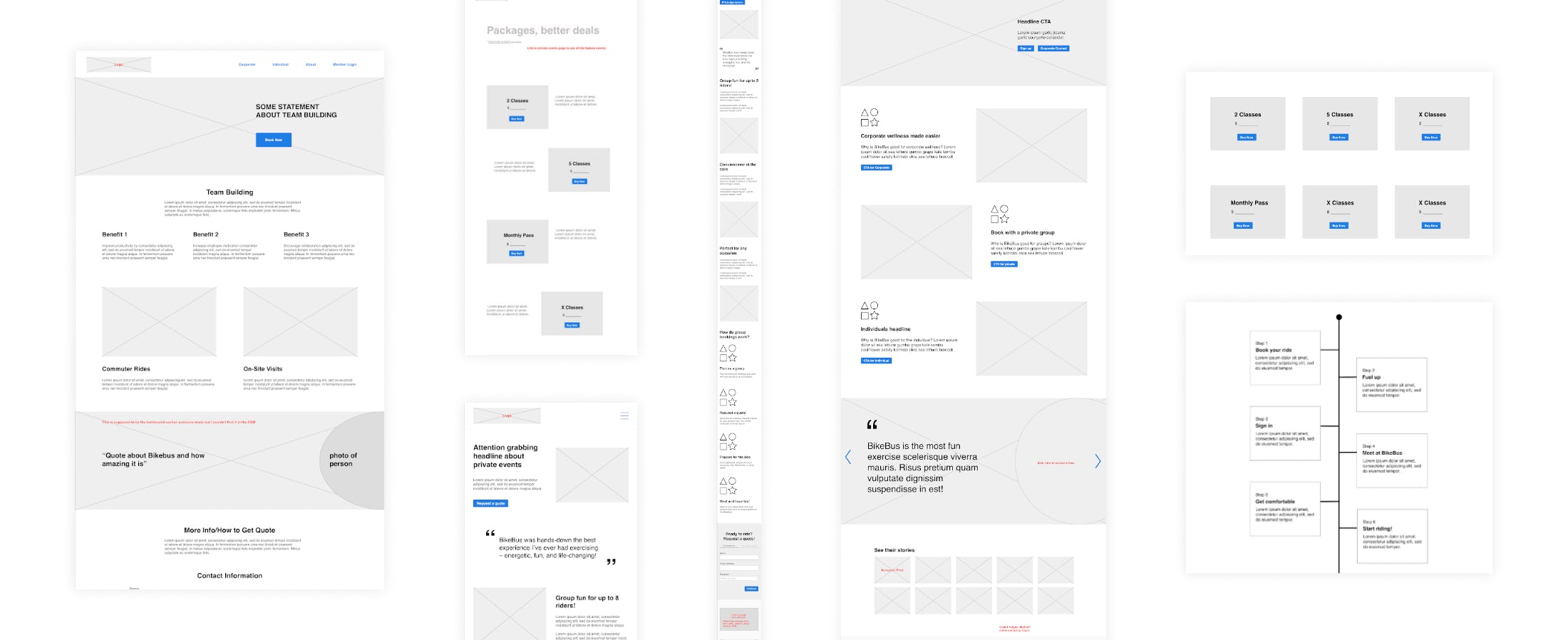
Lo-Fi Wireframes
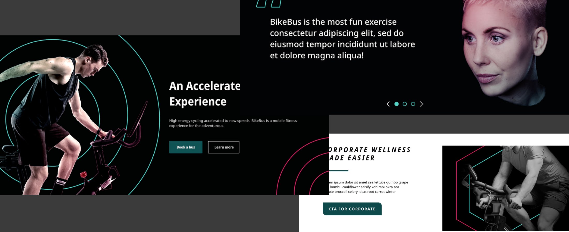
Hi-fi Wireframes and development
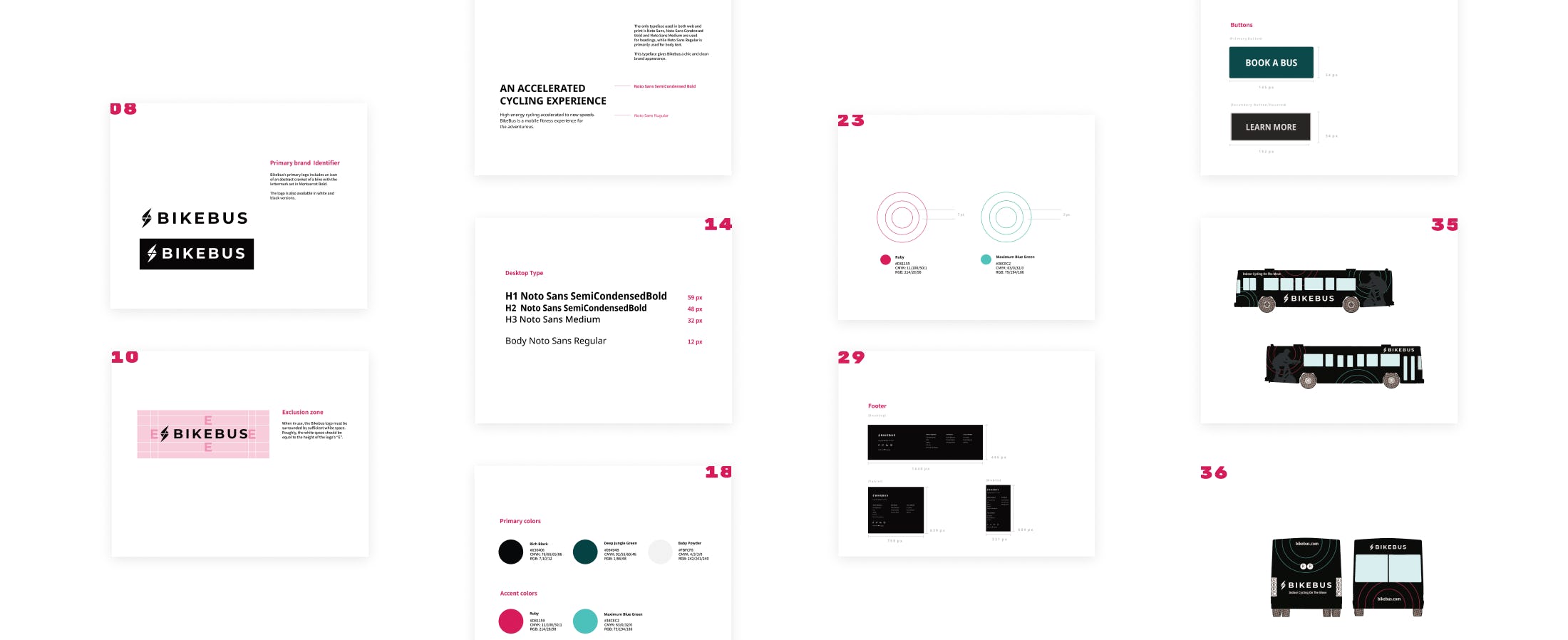
The Brand Book
Final Retrospective
We overshot our deadline (last day of classes) by two weeks in the end while we finished up development work. In retrospect, it would have been helpful to start developing a little earlier in the process. Two-thirds of the way through the semester, we held 1:1 check-ins. From these check-ins, the team felt, for the most part, that they were decently satisfied with the progress so far and the direction but could have used more structure and guidance. In retrospect, establishing harder guidelines and starting development earlier would have helped finish the project on-time and would have created a more cohesive design. The designs were implemented in the end and as mentioned earlier, the brand book would help the client in the future with how to design their site.